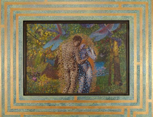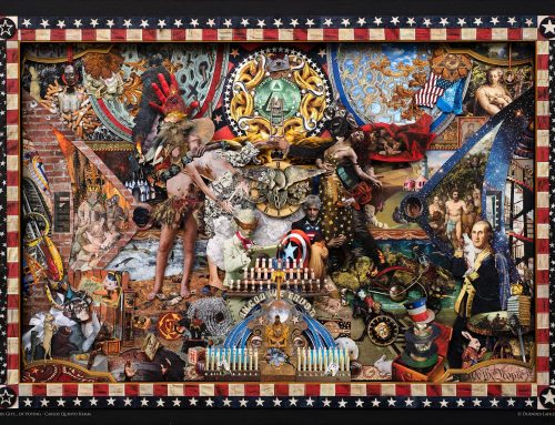
Understanding Composition in Mixed Media Art
Creating mixed media art isn’t just about gathering different materials—it’s also about arranging them in a way that makes sense and looks great. Composition is the way elements are placed in a piece to create balance, harmony, and a clear focal point. Good composition makes a collage feel complete, guiding the viewer’s eye through the artwork naturally. This guide will help you understand how to structure your mixed media pieces to create visually striking art.
What is Composition?
Composition refers to the arrangement of elements—such as paper, paint, fabric, and found objects—within a piece of artwork. In mixed media, composition helps bring different materials together so that they don’t look random or cluttered. A well-balanced composition makes an artwork more engaging and helps tell a story or express an idea. When an artwork has strong composition, it feels more polished, and viewers can easily connect with it. Without good composition, even the most beautiful materials can seem disconnected or overwhelming.
The Rule of Thirds: A Simple Way to Arrange Your Art
The rule of thirds is an easy way to make sure your composition looks balanced. Imagine your artwork divided into a grid of nine equal squares. The key idea is to place important elements along the grid lines or at the points where they intersect. This technique makes your artwork more visually dynamic and interesting than if everything were placed right in the center.
- Focal Points – Place the most important parts of your collage at one of the intersection points. This makes your artwork look more dynamic instead of placing everything in the center.
- Balance – Keep the visual weight of your elements spread out. If one side of your collage has too much going on, the other side should have enough elements to balance it out.
- Movement – The rule of thirds helps the viewer’s eyes move naturally across the artwork instead of just focusing on one spot.
- Test It Out – Before gluing down elements, try moving them around based on the rule of thirds. Take a photo and see how your eye moves through the piece.
Using Contrast to Make Your Art Stand Out
Contrast is when two or more elements are very different from each other, making certain parts of your artwork stand out. You can use contrast to create excitement and depth in your composition. Without contrast, everything might blend together, making the artwork look flat or uninteresting.
- Color Contrast – Light and dark colors placed next to each other create visual interest. For example, a bright yellow shape on a dark blue background will stand out more than if it were on a light-colored background.
- Texture Contrast – Smooth and rough textures placed together add depth to your collage. A glossy photo next to a torn piece of fabric makes both elements stand out more, giving the piece a tactile feel.
- Size Contrast – Mixing large and small elements keeps your composition from looking flat. A tiny button next to a big painted shape draws the eye and helps create variation in your artwork.
- Shape Contrast – Combining organic shapes (curvy, flowing) with geometric shapes (sharp angles, straight lines) creates a dynamic and visually exciting look.
- Pattern Contrast – Layering bold patterns over plain backgrounds or mixing different patterns together can add an exciting element and give your piece more energy and movement.
- Testing Contrast – Before finalizing your collage, step back and look at it from a distance. If everything blends together, consider increasing contrast in certain areas to make key elements stand out more.
Creating Depth and Layers in Mixed Media
One of the best things about mixed media is the ability to create layers. Layers help add depth, making your artwork more interesting and engaging. When layering is done well, it gives the illusion that elements are placed at different levels, almost like looking through a window into different parts of the collage.
- Background, Middle Ground, and Foreground – Think of your composition in layers. Start with a background layer (like paint or printed paper), then add middle layers (like fabric or magazine clippings), and finally, place foreground elements (like small objects, beads, or thread) to create depth and dimension.
- Overlapping Elements – Instead of placing everything separately, let some elements overlap slightly. This technique makes the artwork feel more connected and visually cohesive.
- Transparency and See-Through Layers – Using semi-transparent materials like tissue paper or thin paint washes allows the layers underneath to show through, creating a sense of depth and making each layer feel more integrated.
- Shadowing Techniques – Adding shadows with paint, ink, or darker tones underneath objects can give the illusion that elements are raised or sitting at different levels in the composition.
- Physical Dimension – Adding thick materials, like fabric, cardboard, or found objects, physically raises parts of the collage, making it more interactive and textured.

Guiding the Viewer’s Eye with Leading Lines
Leading lines are shapes, marks, or patterns that guide the viewer’s eyes across your artwork. They help create movement and flow within the piece. Without leading lines, the viewer might not know where to look, and the composition could feel scattered or disorganized.
- Curved Lines – These create a sense of softness and natural movement, making your artwork feel more fluid and easy to follow.
- Diagonal Lines – These add energy and direction, making the composition feel more dynamic and engaging.
- Repeated Patterns – If you repeat shapes, lines, or colors in a certain order, the viewer’s eyes will naturally follow the pattern, making the artwork feel more structured and cohesive.
- Arrows and Paths – If your collage has arrows, roads, or paths, they can subtly lead the eye from one part of the piece to another in a smooth, flowing way.
- Framing Elements – Using elements like borders, archways, or framed objects helps direct focus to the center or focal area of the composition.
Choosing a Strong Focal Point
A focal point is the main thing you want people to notice in your artwork. It could be a bold color, a striking image, or a raised texture. Without a strong focal point, your collage may feel too chaotic, and the viewer may not know where to focus. Having a clear focal point helps guide the viewer’s eye and gives your piece a sense of structure. A well-placed focal point makes an artwork feel intentional and complete, rather than overwhelming or cluttered.
- Make it Stand Out – Use color, contrast, or a unique texture to make your focal point pop. Bright or complementary colors will immediately draw attention, while raised elements or bold textures can make an area more noticeable.
- Placement Matters – Don’t always place the focal point in the center. Experiment with different positions using the rule of thirds to create a more dynamic composition. A focal point placed slightly off-center often feels more natural and visually interesting.
- Surrounding Elements – Arrange other elements in a way that draws attention to your focal point instead of distracting from it. Leading lines, color repetition, or layering techniques can all help naturally pull the viewer’s eye toward the main subject.
- Limit Competing Elements – If too many things are fighting for attention, the viewer won’t know where to look first. Avoid cluttering the space around the focal point with too many bold colors, textures, or competing details. The goal is to enhance the focal point, not overwhelm it.
- Test the Impact – Step back and look at your artwork from a distance or take a photo to see if the focal point stands out as intended. If necessary, adjust colors, contrast, or placement to strengthen its presence.
Using Empty Space to Create Balance
Not every part of your collage needs to be filled with elements. Leaving some areas open, known as negative space, helps balance out busy areas and makes the composition feel less overwhelming. Negative space provides visual breathing room, helping highlight the main elements without making the piece look too crowded.
- Gives the Eye a Rest – Too many details in one place can make an artwork feel cluttered and overwhelming. Empty space allows the viewer’s eye to pause, making it easier to appreciate the composition as a whole.
- Draws Attention to the Focal Point – Negative space around a focal point makes it stand out even more. If an important element is surrounded by too much clutter, it loses its impact.
- Creates Simplicity and Elegance – A well-balanced piece has a mix of detailed and open areas. Even a piece with lots of textures and materials can feel more sophisticated when empty space is used wisely.
- Experiment with Placement – Try shifting elements around to see how negative space changes the balance of your artwork. Sometimes removing an element rather than adding one improves the overall composition.
- Use Negative Space Creatively – Negative space doesn’t have to be completely empty. It can include subtle textures, faint washes of color, or lightly drawn patterns that enhance the composition without overpowering it.
Experimenting with Composition in Art: Try New Ideas!
There’s no single right way to arrange your mixed media collage. The best way to improve your composition is to experiment with different techniques. Trying out new ideas can help you find unique arrangements that make your artwork feel fresh and exciting.
- Move Things Around Before Gluing – Try placing elements in different spots before making them permanent. This allows you to see which arrangement works best before committing.
- Use a Viewfinder – Cut out a small window in a piece of paper and move it over your artwork to see how different areas look when framed. This helps focus on sections of the artwork and reveals interesting compositions that might not be obvious at first.
- Try Different Layouts – Sometimes flipping an element upside down, placing it diagonally, or arranging materials in an unexpected way creates a more interesting composition. Don’t be afraid to challenge traditional layouts.
- Layer and Remove Elements – Build up layers and then remove or rearrange them to see what works best. Sometimes, less is more, and simplifying an area can make the composition stronger.
- Play with Scale and Proportion – Experimenting with the size of elements in your collage can dramatically change how the viewer experiences the piece. Try enlarging or shrinking certain pieces to shift focus.
- Take Photos and Compare – Photograph different versions of your collage as you experiment. Looking at the artwork from a different perspective—such as in a photo or from a distance—can reveal new ideas for improvement.
- Keep a Sketchbook of Ideas – If you come across an interesting composition idea, sketch it out or take notes. Keeping track of successful layouts will help you refine your composition skills over time.
Experimentation is key to developing your own artistic style. By continuously trying new approaches and stepping outside of your comfort zone, you’ll discover new ways to make your mixed media compositions more engaging and visually impactful.
Bringing Your Collage All Together
Composition is what makes a mixed media collage feel complete and visually appealing. By using techniques like the rule of thirds, contrast, layering, leading lines, and focal points, you can create artwork that is both exciting and well-balanced.
At Duende’s Lair, we love helping artists explore their creativity. Whether you’re a beginner or an experienced creator, understanding composition will take your mixed media collages to the next level. Keep experimenting, have fun, and create art forms that speak to you!
Ready to improve your mixed media skills? Check out our collection of handmade collages and get inspired for your next masterpiece!